Conversion Rate Optimization for Ecommerce Brands: The Complete CRO Guide (2022)
Identify the mistakes causing your low conversion rate and learn how to fix them with proven conversion optimization strategies.

While attracting many visits to your Shopify store is good, it's another thing to keep and convert them into buyers. You landed here because you're tired of losing plenty of opportunities and want to make more sales.
The first question you should ask yourself is, are you making your customer's purchasing journey as easy as possible? Well, I understand if you don't know just yet.
Low conversion rates are the number one enemy of any business. In this post, I will ditch the miracles and guess games into the trash and show you what is really necessary to polish your website and surpass the average conversion rate.
If you know what conversion rate optimization is (CRO.) Good for you. But not everyone does. So, let me explain the basics before diving into what are the reasons causing your low conversion rate and how to optimize it.
What is conversion rate optimization
Conversion rate optimization, or CRO, is the process of optimizing your store to generate more sales and decrease your acquisition costs. CRO is achieved through different tactics such as split and A/B testing, multivariate, and content enhancement.
Do I really need to explain to you what the benefits of CRO are? Maybe in another post.
Before optimizing your conversion rate, let's understand how to calculate it.

The formula is straightforward.
Conversion rate = total number of conversions (sales) / total number of visitors) x 100
Suppose you had 175 sales and 8125 visitors last month. Your conversion rate is 175/8125 (.0215) multiplied by 100, which equals 2.15%.
Average Conversion Rate
The average eCommerce conversion rate varies depending on the industry, and the average fluctuates around 2%.
I won't get into the details for all industries. But, I will share some benchmarks for brands I mostly work with.
If you're a cosmetic brand, the average conversion rate is 2.98%
In more detail, for
- Beauty Products: 2.16%
- Skin Care: 2.5%
For fashion brands, the average conversion rate is 3.3%. Finally, health and well-being are at 3.64 percent.
What is a Good Conversion Rate
I would argue that there is no correct answer to this. The reason is that there are many factors and no fit-all size. It depends on the pricing of your products, the current stage of your business, whether you're doing everything by yourself or have a team, and so many other things.
If someone is all by himself and still manages to attain a conversion rate of 2%. I'd say that's a pretty good start. Don't be too hard on yourself. A "good" conversion rate when you're starting is typically 1% to 2%.
When you start to understand what is causing your actual conversion rate, everything starts to fall into place, and every day you find a new piece to your CRO strategy, which ultimately will lead you to a higher conversion rate.
Identify The Reasons You Have a Low Conversion Rate
There are plenty of reasons that can negatively impact your conversion rate. The first one is confusion. Misleading your visitor results in an automatic drop-off.
When those reasons start to stack up, it is pretty easy to find yourself below 1%, which is horrible.
Before diving into how you can improve your conversion rate, I'd like to show you all of the reasons I could find that impact your conversion rate.
Understanding it from this perspective will give you many "ah-ha" moments and help you improve more efficiently.
1. Your Home Page Looks Like a Journal
If your home page looks like a journal, I'm reading one word out of 20.
People don't read. They scan, especially when they're not in "reading mode."
Put yourself into your customers' shoes. They want to buy your products and you're throwing a bunch of nonsense at them. They have to scroll three times before finding your products.
If you want to share your brand story, mission, and values. It doesn't belong on your home page.
You want your customer to leave your homepage ASAP. Your homepage should have one purpose: to lead your customers to your products as soon as possible.
I suggest you explore my blog, where I talk about how you should storybrand your eCommerce store.
2. You Are Not Leveraging Landing Pages For Your Campaigns
In case you didn't know. A homepage and a landing page are not the same things.
There are significant critical differences between them. A landing page is designed to convert your campaign's visitors with zero distractions. You likely won't find a navigation menu or any irrelevant links.
It's the perfect place to implement the storybrand framework.
3. You Only Focus On Attracting New Customers
If you're only dedicating your time to attracting new customers while forgetting about your existing customers, you're on your way to failure.
Not only can you make more money, but it's way easier to accomplish.
Your primary goal should be to try to understand your customers as if they were your friends. And you'll see how things will change. You are doing everything for them, not for yourself. So, listen and adjust to their needs.
4. You Attract The Wrong Target Audience
I'm sorry, but I have to make you realize that not everyone is interested in your products. Try to sell to everybody, and you'll sell to nobody.
Marketing to the wrong target audience can have a severe negative impact on your conversion optimization.
It's crucial to study and understand your audience. That's why a solid brand strategy is essential and can help you tremendously.
Knowing who your ideal audience is makes everything easier.
You know where to find them, how to talk to them, and how to make them interested in your products.
One way to attract your ideal customer is to use brand storytelling.
5. You Try To Be Clever Over Clear
It's one of the worst mistakes you could ever make. Always prioritize being clear over clever. It should be your primary goal, Always!
The best way I can put it for you is to use terms that ordinary people are googling. For one, your eCommerce site will be SEO friendly (search engine optimization), and for two, your visitors will understand what you're selling.
I hate it so much when I come across an eCommerce store and don't even know what they are selling.
I literally need to search their website and read about their products to understand what they're selling.
Avoid this at all costs. Your visitors need to understand what your website is about in less than 5 seconds.
If you don't make a good impression on their first visit. Likely, your visitors won't ever come back to your website again.
You can explain what you sell with visuals, texts, or both.
But, as I mentioned. You have to ditch the guessing game.
Don't let your customers wonder what you're selling.
So, explain what you sell and how you will help them resolve their pain.
Let's explore some good examples of brands that prioritize clear over clever.
1. Wholier

What they sell: Plant-based nutrition to optimize your health.
How they help you: Whole Food Multi for Plant-Based People.
2. Snow

What they sell: Teeth-whitening products
How they help you: Get a whiter smile in minutes a day.
3. Dr. Swatch

What they sell: Soaps and deodorants.
How they help you: Feel like a man, smell like a champion®
There are other factors to consider. And again, the most important thing is to listen to your customers. It isn't 100% necessary to add a one-liner if all your visitors are coming through your social media, and what you sell is crystal clear.
You can use your hero section to promote your best sellers, coupon codes, bundles or recent new offers.
6. Poor Quality Products Images
Would you be more attracted to visiting a home with stunning or bad images? The answer is pretty straightforward.
Your visitors need to see what they're buying, and the more they visualize themselves using your products, the more they're inclined to buy.
If you have poor-quality product images, it's probably harming your online store.
Don't you know if your photos are good or bad?
Compare it to your competitors and ask yourself if you would buy from your store or his. Be honest.
The shortcut for this is to ask HONEST friends that won't lie to you and say it's beautiful while it's not. I hate this! I want the truth, as bad as it might sound.
Poor product images can make your store seem untrustworthy and potentially turn off many of your visitors. My honest advice? Hire a professional brand photographer ASAP.
7. You Don't Have Positive Reviews
You know it yourself before buying online or even going to a restaurant.
You'll look at the online reviews before. People will always need to be self-conscious about their decision and not get scammed. Especially now that consumers are savvier.
You guessed it, without positive reviews, your visitors have more reasons to leave your website. So, make it a priority and collect positive reviews for better results.
8. You Forgot The Existence of Google Analytics
Are you guilty of this silly mistake? It's okay. You're not alone because I've been there too.
As I said earlier. You need to ditch the guessing game. So, Google Analytics or any other web analytics tool is a must for your eCommerce store.
It will help you collect data and better understand how your audience behaves.
I don't like the traditional evil marketing tactics where you target people who visited your store but didn't purchase and start bombarding them with ads.

Instead, I like to use my analytics to understand my strategies' effectiveness. Everything you do should have a purpose, and data helps you refine your strategy and ultimately crush your goals.
9. Not Testing Your Marketing Strategies
From my previous point, where if you don't use Google Analytics. You don't have anything on which to base your next moves on. You play the guessing game and wait for miracles to happen. All of your marketing efforts would be in vain.
You have to try and analyze your strategies. A/B tests are an excellent way to do it. You compare two versions of the same page to see which one converts better. When you run A/B testing, you advertise or show the same page to two similar groups of visitors simultaneously.
I must warn you that you must have significant traffic to your website before carrying out A/B tests. If your sample size is too small, you won't have tangible results that can be considered accurate. Therefore, you need to calculate if your sample size is large enough to run an A/B test.
You can do it here.
10. Nonexistent Popups
If you think popups are annoying. You're right. But surprisingly, they are very useful in eCommerce.
The average pop-up conversion was 3.09% in 2020.
It also can boost your conversion rates by up to 28%.
The bottom line is don't be shocked your visitors aren't converting if popups are nonexistent on your Shopify store.
11. You Forgot The Existence of Email Marketing
I'm a little hard on you. But, it's for your own good. Really, 80% of retailers consider email marketing as the most effective way of customer retention.
You are missing a lot of untapped potentials if you aren't using email marketing. It's time you take it seriously and start growing your online store.
Start collecting your visitors' email addresses immediately. You must know that you should do your research before following what everyone is doing, especially if you're a premium or luxury brand. The last thing you want to do is offer a discount.
12. Poor User Experience
A poor user experience is the worst thing you can offer your potential customers. There are a lot of things that can make someone decide they have had enough. Your website is taking ages to load, has many broken links, a popup showing every time they refresh the page, and the list goes on and on.
Make sure your online store is optimized for mobile devices. You have to take your customer experience seriously. If your website isn't mobile-friendly, you are automatically hurting your conversion rate, and you'll have a high bounce rate.
How to Improve Your Conversion Rate
Now that we covered most of what could hurt your actual conversion rate. It's time to dive deep into how you could improve it. Many store owners will read this blog post but don't act on it. I understand that reading this much information can be overwhelming.
But hear me out. I'm not telling you to apply everything on the same day.
In fact, I don't think it's a good idea. Instead, divide it into several steps and improve one to two things at a time.
Does the question now become how to know which one to improve first?
Well, if you understand your sales funnel. Knowing what you should improve first becomes an obvious choice.
Let's get into it.
Understand Your Sales Funnel
Your sales funnel is technically the road your visitor is taking before making a purchase. Where are they coming from? A visitor from your blog is very different from another from TikTok.

You shouldn't design your conversion funnel the same way for those two different groups of visitors.
You first need to understand how many places your customers are coming from. So, make a spreadsheet and organize your list from the highest traffic source to the least one.
TikTok and Reels
Let's say you came up with your numbers, and you noticed that most of your traffic comes from your TikTok and Instagram Reels.
By default, those visitors have a shorter amount of attention span.
You lose them if you give them too many tasks before finding your products!
Think of it this way. You worked hard mastering a good hook for your videos, showcasing your beautiful product with good storytelling. But, you failed at simplifying their purchase journey. They have to accomplish endless tasks before buying your product.
- Click on your link in the bio
- Click on another link to access your website
- Search for the product advertised
- Try to find it (very likely to abandon it)
- Click on the product once they find it
- Click on Buy now
- Checkout process
I don't get why brands put their socials into their link in bio.
These are additional distractions that can take your customers away.
Treat it like a landing page. First thing first, make your link in bio shoppable. This means your customers can purchase directly from your link in bio. How? Shopify built a fantastic tool named Linkpop.
Ask yourself this question: What action do I want my visitors to take? Is it to buy your newest bundle, or is it to have their emails? It all comes down to test, test, and test! You have to test your strategies and optimize them accordingly. I made it easy for you to get started.
- Create your Linkpop page
- Answer this question: What specific action do I want my visitors to take?
- Design your page strategically to help your visitors take the desired action
I hate it when brands stuff all of their socials into the link in bio.
Are you doing it because everyone is doing it?
Well, put yourself in your customers' shoes. Imagine you find a brand on TikTok, and you're already interested in their products.
Why would you want to go to their Instagram, Pinterest, or YouTube? Your website is already doing this particular task.
If they really want to find your Instagram profile. Believe me. They can.
You are distracting them and bringing them somewhere rather than helping them buy your products. The main factor behind people leaving is confusion. Avoid it at all costs!
Visitors who click your link in bio should not
- Be exposed to any additional distractions (links to other social media)
- Have too many choices (more than three products)
Instead, you want to help them have a seamless buying experience. For instance, one of your videos about your new bundle is going viral.
You want to make it as simple as possible for your buyers.
- Remove links redirecting to your other social media
- Show your logo to avoid confusion
- Display the bundle at the very top
- Add buttons that can lead to your homepage and collections page.
- Done
Now, your customers who are interested in your bundle go through a seamless process:
- Click on your link in bio
- Click on the bundle image
- Click on Buy Now
- Checkout process
They can still visit your website or collections page if they're not interested in your bundle.
We aren't forcing them to do anything.
We are helping them.
Blog
As I said, someone who discovered you through your blog will have a different buying journey. Oh yes. You should have a blog for your eCommerce brand.
You most likely answered one of your visitors' concerns. But they might have many. Readers are most savvy and thorough. So, trust is essential.
They want to know everything about the brand before buying something. Hint, I'm just like that!
Maybe, you are too.
Your number 1 goal is to grab their email with something relatable to your blog post. For instance, you wrote a blog post about a list of natural ingredients used in your products. Your opt-in could be about "learn how our ingredients can benefit your health." You are not selling but educating for at least three emails in your email sequence. Then, you sell.
If one of your blog posts is precisely about one of your products. It wouldn't be a surprise that you're redirecting them to the product's specific page.
Have a look at Klur. They wrote a Guide to Gentle Cleansing Practices.

They strategically implemented their product at the end of the article.

Don't redirect them to somewhere broad such as a collection page or home page.
Something you always want to keep on track is broken backlinks. This is something very frustrating. Website visitors who discover and read your blog post are most likely to be interested in very detailed product descriptions, reading ingredients, and reading reviews. So, make sure you're nailing those down.
I hope that now you understand the importance of your sales funnel. Don't neglect the power of strategic design and user experience.
Upgrade Your Store Design
Upgrading your website design shouldn't be your top priority if you're starting.
But, if you're already making 5-6 figures in monthly sales.
It's definitely a priority.
You don't want to look like a dropshipping store. I have nothing against them. But hey, we all know how they look. To appear as a legitimate brand, you should differentiate yourself.
Even dropshipping stores are doing their best to NOT look like a dropshipping store.
So, my question is simple. Does your website look like a dropshipping store? If yes, I don't want to hear any excuses. Upgrade it now.
Shopify Conversion Rate Optimization Strategies
A conversion rate optimization isn't only for your home page. It applies to your complete store. From the moment your customer lands on your website to his last moment. We want to lead him to the final step: checkout and make the purchase.
The thing is, it doesn't turn out that way every time. Many of them will leave from the moment they land, and others will explore your products, get distracted by their dog, cat, or whatever it might be, close their phone, and never return to your website again.
That's why I want to divide this section into small sub-sections in which we will cover your customers' journeys and optimize everything to transform their visit into a purchase.
Please understand that the CRO process is an ongoing process.
You don't do it for one month and never look back. Instead, you must embrace how your audience behaves and serve them accordingly by optimizing your eCommerce website and responding to their needs.
The bigger your brand, the bigger you need to carefully play this game.
It's not guessing and plugging. It should always start from a data-driven approach, customer-centric and ongoing learning and adaptation.
I put together a list inspired by Shopify themselves and some CRO agencies that will get you started and hopefully understand how you can use these strategies to grow exponentially.
- Understand your customers' pain points and objections
- Homepage
- Product Pages
- Product Discovery
- Checkout Process
- Crystal Clear Shipping and Returns
- Customer Retention
1. Understand your customers' pain points and objections
It all starts with your customers. Without them, you don't have a business to run. So, it's pretty obvious that you want to keep them your HIGHEST priority. By that, I mean understanding their pain points and objections. Not assuming them, but literally finding out exactly what they are and resolving them.
Easier said than done. I get it. If it was easy, everyone would be doing it. It isn't easy to run an eCommerce business. If someone told you that it is, he lied to you. Believe it or not, one of the best ways to grow your revenue is to focus on your existing customers.
I was consistently going to a café for a very long time, at least three times per week for 4-6 months. At first, the owner was very, very kind and helpful.
By the fifth month, he wasn't the same. He was privileging new customers. He forgot all the small things he was doing at the beginning, such as asking if everything was okay, bringing food as fast as possible, and all the little details.
He thought that now that I'm coming every time, I could wait a little longer than usual before having my food. Wrong! I went somewhere else.
In a different experience at a French restaurant in Montreal, the staff manager was so amazing. I went to this restaurant every Friday for three years, and the experience was always fantastic as if it was the first day but 10x better.
The bottom line is to treat your current customers as if they were your family and your business depends on them. Stop chasing new customers and focus on your current ones.
Let's explore how you can do that.
Survey your existing customers
You'll discover that there will be patterns most of the time. You need to find the blind spots of your audience and fill the gap. Many of your current customers face the same problems.
You can ask them what made them buy your product, what made them almost abandon their purchase, and what other questions they have about your products.
With insights from your survey. You can use those to create data-driven A/B tests and witness your sales grow. You must look closely at your results and constantly try to improve your customers' experience.
I will repeat it, do not play the guessing game. Are you a business owner or a fortune-telling guru? I'd say you're a business owner.
If you think you're running data-driven A/B tests, think again.
Are you really? Do you have a sample size large enough to run your tests? Are you taking "inspiration" from one of your competitors?
So, if you're guilty of those, don't be surprised if you're not achieving a high conversion rate for your Shopify store.
Talk to your customers
Talking to your customers doesn't stop at exchanging DMs and emails with them. There is no better way than having an actual phone conversation or video conference call.
This means you should pick up your phone and call them. Have a genuine conversation with them and offer them a coupon code at the end of the call. A win-win situation because, trust me, you'll learn a lot. And I mean a lot. You must have some good questions and not get too much out of context.
It could look like “Hey [customer name], I’m [your name] from [brand name]. We are asking our amazing existing customers a couple of questions to serve them better, and you are one of them. Do you have a quick 8 minutes for me to help me better understand your needs with [brand name]?"
Have a look at your last month. And try to call every one of your customers—even those who gave a bad review. Tweak the script and adjust it to your brand's tone of voice. I won't teach you how to speak to your customers in this post. But, I'm telling you. This could be the best thing you'll do for your brand. If your current conversion rate is mediocre, don't let your customer service be one of the reasons it is.
2. Homepage
As I mentioned initially, your homepage should not look like a journal. And yet. I'm seeing this with many brands. Even Brad Pitt's skincare brand "Le Domaine." It looks like a journal. Avoid imitating his website at all costs! They butchered all the basic best practices of eCommerce and user experience. They might have updated their website by the time you're reading this. That's why I included some screenshots of what it looked like.

Not having a call to action in your hero section is your first way to put your customers into a labyrinth. You clearly do not want that!


Your products should be available in one scroll right after your hero section.
Again, it's not to diminish their brand or decisions. But it's pretty funny that they don't bother to invest in a good website with all those millions. Hate me or don't, but I'm a truth-teller.
Think of it this way. You are walking in the mall and find an attractive retail store selling organic fragrances (candles, soaps, etc.). From the first moment you step into the store, one of the employees starts telling you about their brand story, their products and ingredients, who the founder is and how amazing she is.

I mean, not a chance.
I would turn and get the hell out immediately.
They'll most likely tell you, "Hey, welcome! Don't hesitate if you need any help. We currently have a promotion on our soaps: Buy one and get the second at half price." Oh, interesting. Thank you!
So, tell me. What is the difference with your website? Why do you throw a bunch of paragraphs at your visitors? I'm going to show you how to treat your website as a retail store. He is a virtual employee working 24/24 for you. And you're going to optimize him in a way that is appealing to your customers.
Simplify the user experience
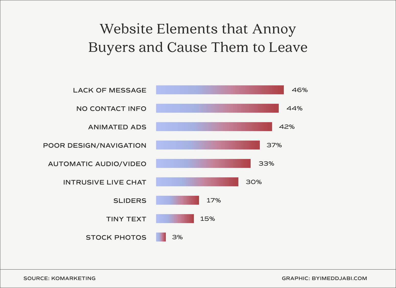
Komamarketing asked B2B buyers, "Which website elements annoy you or cause you to leave a website?" They learned that 46% stated, "Lack of Message (can't tell what a company does)" B2B buyers aren't that different from B2C buyers.
This means that the very first thing you want to do is get your messaging crystal clear. Don't be clever, be clear. You have 50 milliseconds to make a first good impression. Your homepage needs to be visually appealing but, most importantly, simple.
Simplicity is key and comes down to a previous question I asked you: What actions do you want your customers to take?
If you're unsure what you want to feature on your homepage. Consider going with your best sellers, new collections or a new promotion you just launched.
Don't Show Your Opt-in right away
Most websites show their Newsletter Opt-in in the first 5 seconds. Sometimes, everything loads simultaneously. Horrible! Your visitor hasn't taken a breath yet. And you punched him with an "offer." You know that it's very annoying.
Like if I were to give a brand a chance by visiting its website and learning more about it. This pop-up coming in before I even scrolled would turn me off instantly.
Instead, use your Opt-in strategically. Let your customers digest some information about your products, and display the popup at a convenient moment when they're more likely not to close it.
For instance, your visitor landed on your website, scrolled and is now reading about your product. That is a perfect moment to show him your Opt-in whether it's a coupon or an exclusive offer.
Test, test and test again. That's the only way to learn what works best for your brand.
Add Social Proof
Has your brand been featured in a notable magazine or blog? Make sure to showcase those achievements. I understand that not every brand has this privilege. A good alternative to that is User-Generated Content (UGC) which is any form of content created by one of your customers, such as reviews, photos, or videos.
According to Bazaarvoice's 2022 Shopper Experience index, 40% of global shoppers agree that they are more likely to buy a product from a UGC ad.
3. Product Pages
Remember, confusion is your ultimate enemy, and you should remove as many distractions as possible. Each one of your product pages needs to be designed and built to convey your products' real value to your customers, and one powerful way to do it is through brand storytelling.
You must build a compelling story around your product that makes your customer realize, "I really need this."
Your product page aims to help your customer visualize themselves using your product or as if they were testing it at your retail store. Ultimately removing any doubt or frustration, they might feel.
You can afford to go deeper with your product page, which is not limited to text. Do not hesitate to add videos, infographics, and UGC.
Upload High-Quality products images
Who doesn't prefer high-quality photography showcasing the beauty of the product? Did you know that 93% of consumers consider visual appearance to be the key deciding factor in a purchasing decision?
Well, this is a pretty good indicator that you MUST have High-Quality product images. Again, do not limit yourself to images only. Use videos to showcase your product in use. This will help your customers visualize themselves using your products.
Write Good and Fun product descriptions
Every good and fun description has something in common. They aren't boring. Did you think your description is only meant to fill the blank space? It's not. Your customer should be able to easily understand your product and how it can help him without a big effort.
That's where a fun description comes into play. It helps your customer read it seamlessly and understand the benefits of your products without even trying. Sounds like something you can't come up with? Hire a copywriter. Believe me. It's worth the investment, just like a brand designer.
Showcase Your Customer reviews
By this point, you know the importance of reviews and UGC. But you might not know how to showcase them strategically. The best way to help you is to show you how others are doing it the right way.

Love Hair uses the power of UGC perfectly by showing it right before the description. If the user clicks one of the videos, he's shown the products used in the video. Well done.

I highly suggest you implement it right away. You will not only increase your conversion rate, but you will also increase your average order value.
4. Product Discovery
Optimizing your product page is good but is your customer getting to that final destination?
Maybe not.
Your job is to ease the process.
Let's see how you can do that.
Optimize your search bar (intelligent search)
It's not as complicated as it sounds, I promise. If your customers are looking for a product, they probably don't know where to find it. Don't worry. You won't need to hire a developer for that. Smart Search & Instant Search is an app that is built specifically for that.
It is essential for you to optimize your search bar if you want to increase your conversion rate. While you're at it, take advantage of it and add "trending search" and "trending products" to potentially lead your visitors to any of these destinations.

Tula Skincare doesn't use intelligent search, but they smartly included "trending search" and "trending products."
Effective product categories
Nobody wants to navigate on your website like they were in a labyrinth. I've been there. Shopify suggests that you opt for four to six broad categories that contain more specific subcategories as a dropdown.

You want to take advantage of your most popular category and place it at the front. Order them in your navigation menu based on their popularity.
I love how Movado use their collection page. With that many products.

They did an excellent job of organizing them effectively.
5. Checkout Process
I can name so many frustrations I went through during my "shopping journey" but I will only list the most important. One of them is being redirected to the checkout page because I clicked on "Add to cart," so annoying! Do not mislead your visitor because it is really frustrating.
Do not redirect to checkout with "add to cart"
Your button says "add to cart"? Then it should only add the product to the cart, not redirect them to the checkout page. In that scenario, it would be "Buy now."

Be clear, and do not mislead.
Optimize your Shopping Cart for Upsells and Crosses
If all your customers see on your cart is "your cart is empty." I'm sorry to tell you that it's boring. It's empty, yes, we know. Then what? Do you want them to go back and look up by themselves to find what they're looking for?
You have to understand that you need to think that you're building your website for the laziest person on earth.
When you start designing for that person, suddenly, you're doing everything differently. Your cart is suggesting to him that he should take a quiz or maybe click here to discover a collection that might suit him.
Design your cart window or page intentionally with the desired action in mind. They clicked on the cart, they might have thought they had added something, but they didn't. Well, now you'll add a button that will take them to your collection page OR to a particular product directly. Hint, your best sellers.
I love pretty much everything about Tula Skincare. They applied everything they could to increase their conversion rate.

Optimize Your Checkout Process
This means you should offer different ways of payment.
Your best bet is to install Shop Pay and Paypal to let your customers speed through checkout in one or two taps.
Enable Guest Checkouts
I can't count the number of times I bounced from a checkout because I was forced to create an account.
You did all this work to waive it off because of not having guest checkout. It is very important that you do.
Otherwise, your abandoned cart rate will skyrocket to the roof.
6. Crystal Clear Shipping and Returns
Your conversion rate will suffer drastically if your visitors need to look up information about your shipping and return policy. Don't waste their time and give them what they want.
What countries do you ship to?
What carrier do you use?
How long does it take?
Do you offer express shipping?
You get the idea. Refine your FAQ with actual questions you get from your customers. Ask them!
Offer Free Shipping
Would you rather buy from a brand that charges you for the shipping or from another one that offers free shipping? Well, we all love free stuff.
There are some exceptions to the rule, but they aren't many. One of the reasons for cart abandonment is unexpected shipping costs.
You also can use free shipping to your advantage and boost your average order value (AOV.) For instance, if your current AOV is $60, you can offer free shipping for orders over $69.
Have a crystal clear refund & return policy
There is no place for confusion here. You have to be very clear about your refund policy. Is it a refund with no questions asked, or do you have some criteria?
Specify exactly how many days the return is eligible. Having unclear policies will leave you with a lot of negative reviews and unhappy customers.
Nobody wants that.
So, do your work.
7. Customer Retention
I love to compare how retail stores work so that you can implement the same principles in your Shopify store. In a retail store, there are real employees who can interact with customers. Respond to their questions and help them. There is one key factor that practically dictates if your visitors are going to become buyers or not; Live interaction!
Use Live Chat
With live chat. You can imitate the live interaction of a retail store. You can answer your visitors' questions in real time, and this can help build a deeper connection with your customers from your very first interaction with them.
You can even set up a chatbot when you're not available with your most common questions. In this way, you're able to collect their name and email addresses that you can use later on to build a deeper connection.
Use Email Marketing
People are busy. But they also check their emails very often. Sending emails doesn't always have to be about selling. You can educate your audience about your products, your brand story, your mission, etc.
Don't be afraid of selling tho! When the time is right, sending promotional offers to your customers can have tremendous benefits for your sales.
In fact, eCommerce email conversion rates tend to average out at around 15%, which is higher than the standard 10% conversion rate attributed to many other digital marketing channels.
Offer a Subscription Option
When done right, your subscription model can grow your sales as you've never imagined.
Your subscription doesn't have to rely on your products. You can be creative and give some perks for joining your subscription. For instance, offering 25% off on all of your products, free shipping, and special offers exclusive to members only. The possibilities are endless.
Your subscription model should encourage your customer to join your community because your offer is a no-brainer if you haven't thought of a subscription model. I highly suggest you do so.
Don't Neglect Cart Abandonment
There is one thing that you must know, 48% of emails on cart abandonment are opened. For every email you're not sending, you're leaving one chance out of 2 of making a sale.
You don't have to start from scratch. Either you hire a copywriter or use Hubspot's 13 free abandoned cart email templates to write your emails and win back customers.
Don't wait any longer
If there is one thing that is gonna move the needle for your online business, it gotta be ACTION.
You have to take action in order to improve your conversion rate and ultimately grow your sales.
Need help? Schedule a fit-call with me, I would love to chat.

Recommended Knowledge
.jpg)


